
Case study · CarTrawler
Mobility 2.0
Reimagining airport transfers — one responsive, white-label platform for airline partners.
- Role
- Lead product designer
- Duration
- 3 months
- Team
- 2 designers, 2 devs, 1 PM
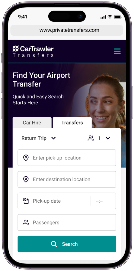
The journey doesn’t end at the airport.
The challenge
Development had started before the core journey was settled.
Airlines could get travellers to their destination, but the journey often stopped at arrivals. Mobility made onward travel simpler for customers, while giving airline partners a scalable product that adapts to their brand, market and commercial needs.
The team needed to:
- Define a coherent end-to-end booking flow
- Work through changing requirements under a tight deadline
- Support the needs of distinct airline partners
- Replace native apps and bespoke integrations
- Deliver one responsive, white-label web platform
Alignment
A shared model for a moving team
- Product
- Partner & commercial requirements, launch scope, roadmap
- Design
- End-to-end experience, prototypes & testing, interaction detail
- Engineering
- Feasibility, dependencies & constraints, implementation
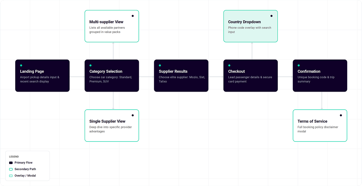
We used the journey as a shared reference for decisions, sequencing and delivery.
My role
Strategy, design & delivery, and leadership.
Strategy
Worked with the product manager to define the experience, launch priorities and delivery plan.
Design & delivery
Planned and ran usability testing, then led detailed design through to engineering handover.
Leadership
Set direction for another product designer and kept the journey consistent end to end.
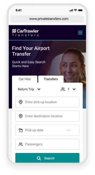
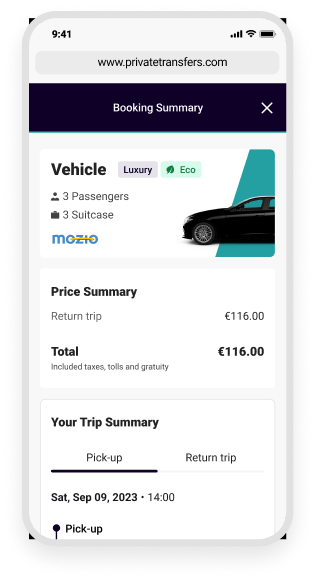
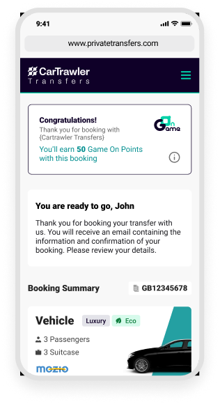
~65% of customers were booking on mobile — so the flow was designed phone-first.
Mobile first
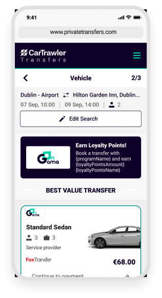
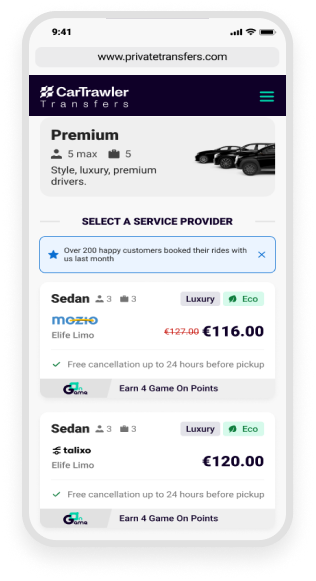
Making the booking journey visible
From first search to confirmation — five screens, one continuous flow.
Research & insights
With no dedicated researcher, I planned and ran two rounds of task-based usability testing with target users on a high-fidelity prototype.
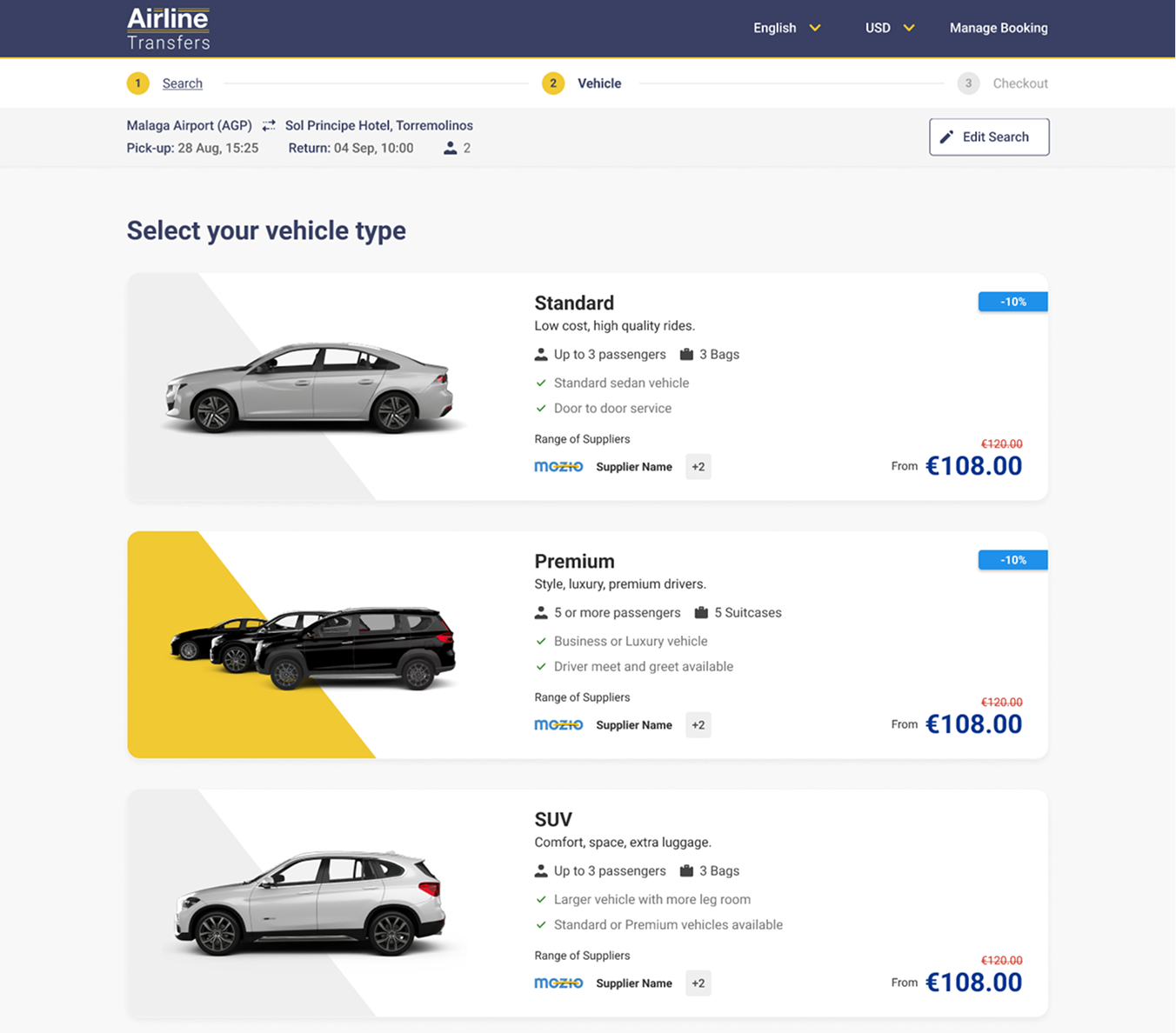
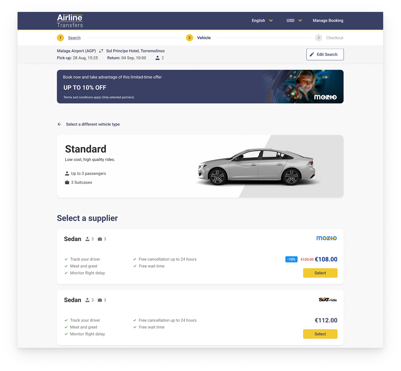
Vehicle selection
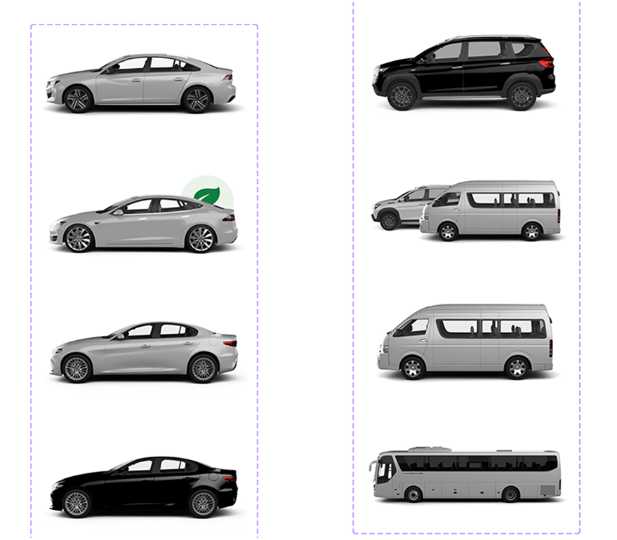
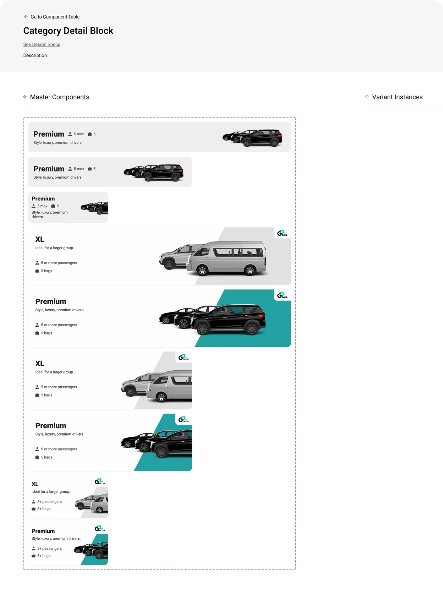
Users struggled to tell overlapping categories apart, and supplier data limited renaming. We revised the grouping, descriptions and how capacity is presented.
Checkout
Forms and payment created friction. We simplified the sequence and progressively disclosed information.

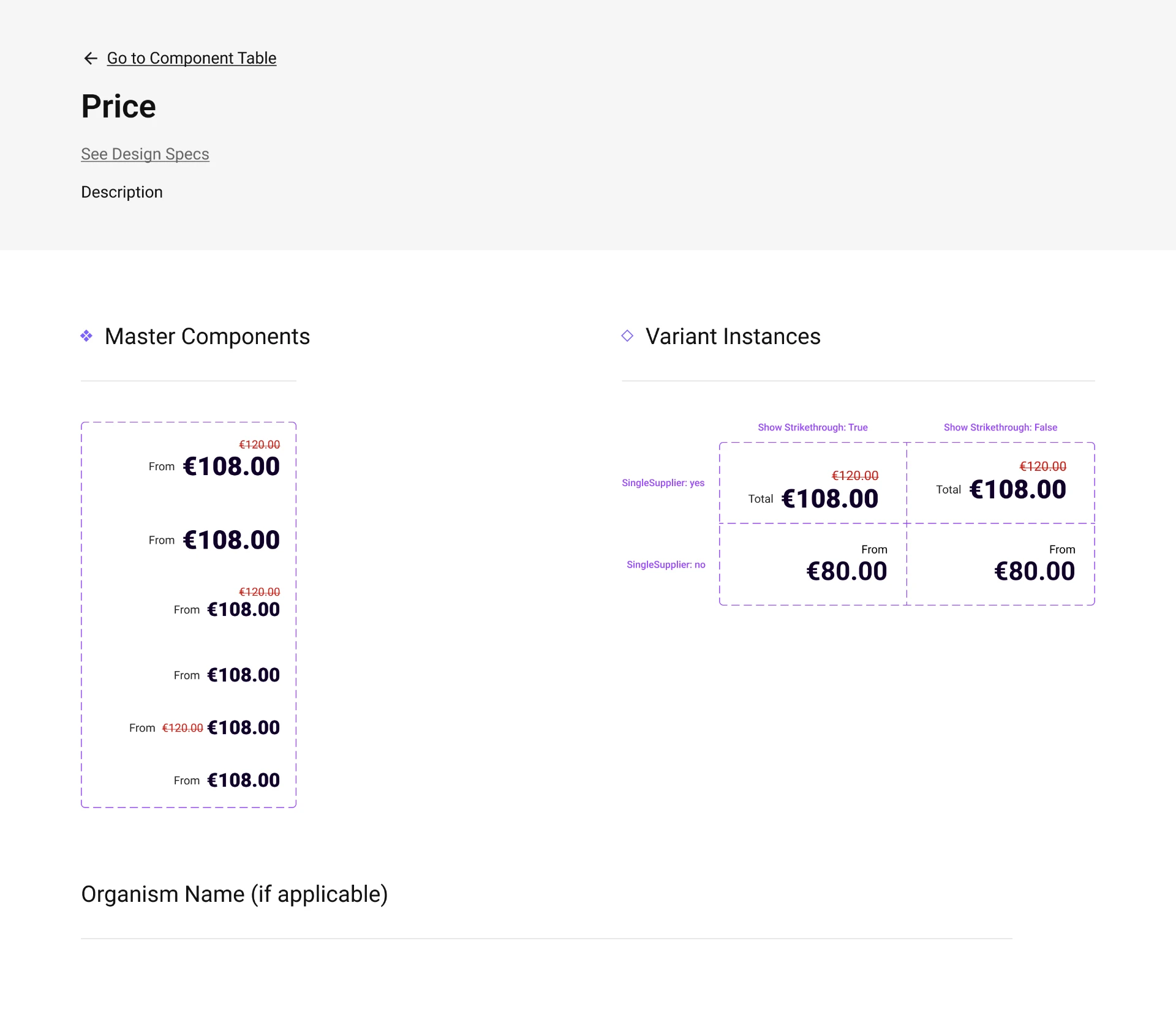
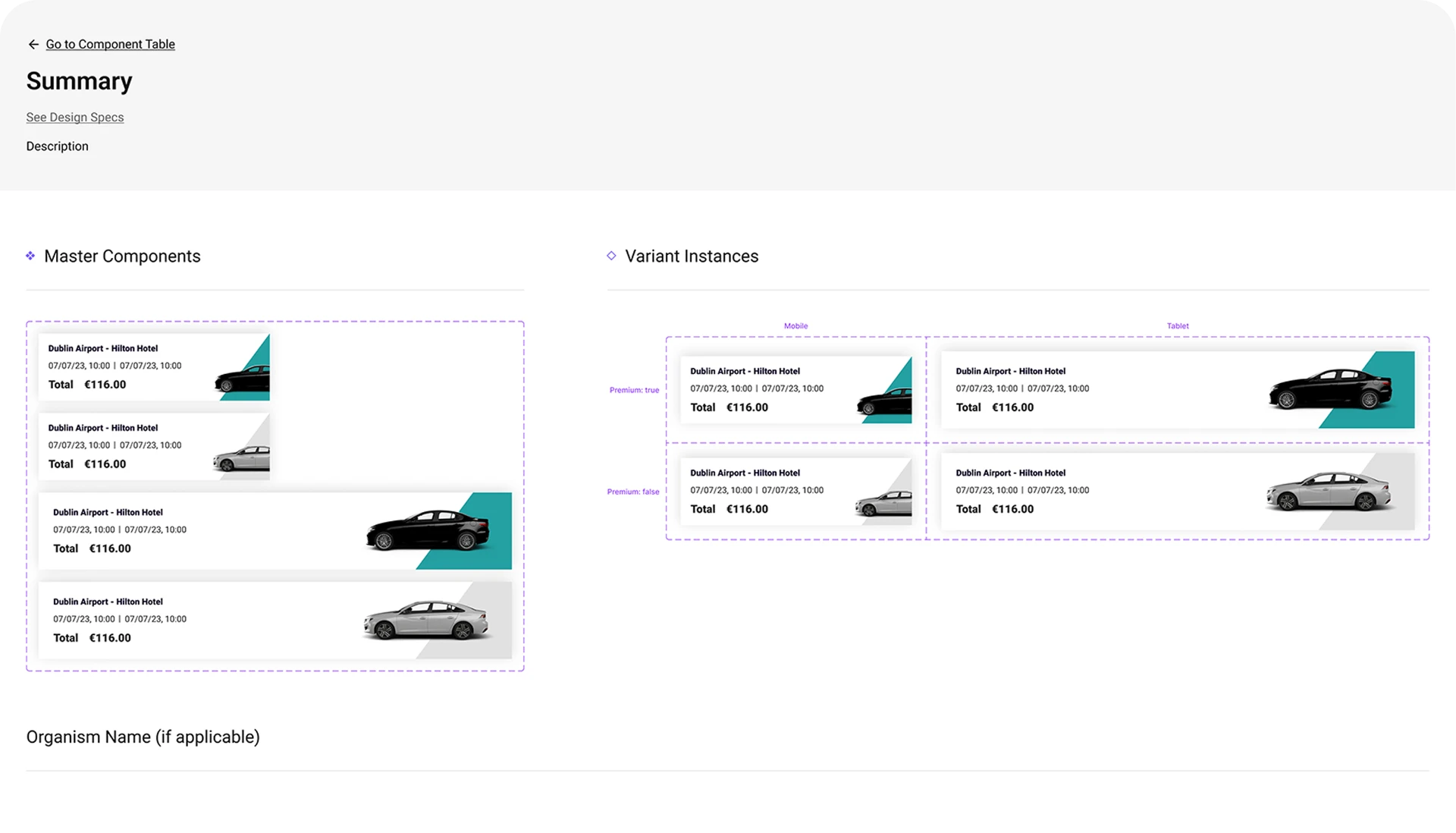
Design system
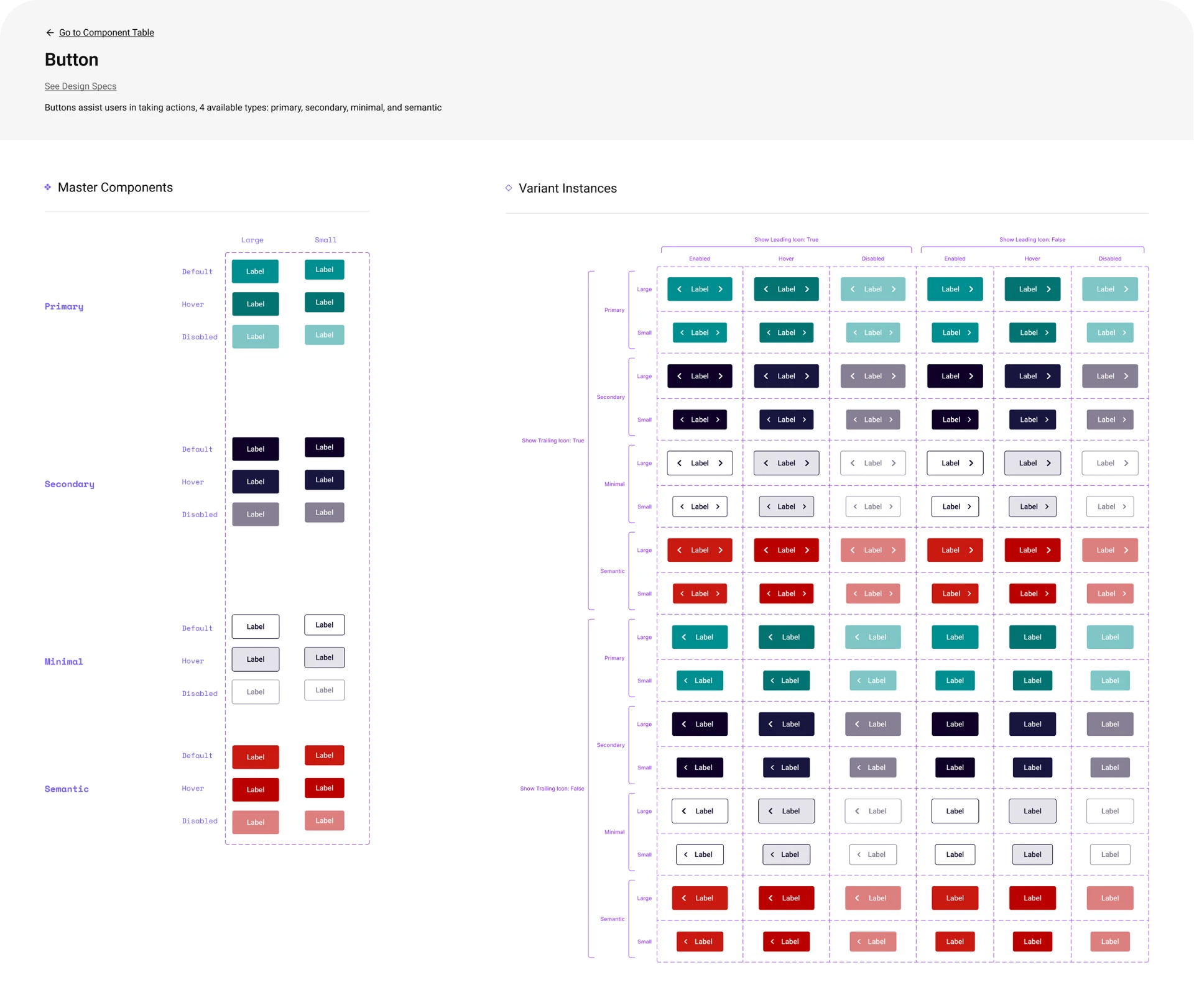
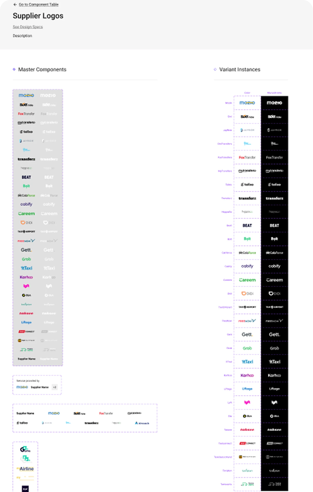
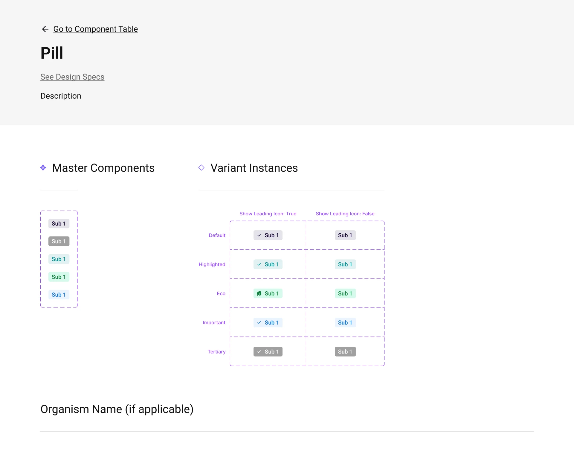
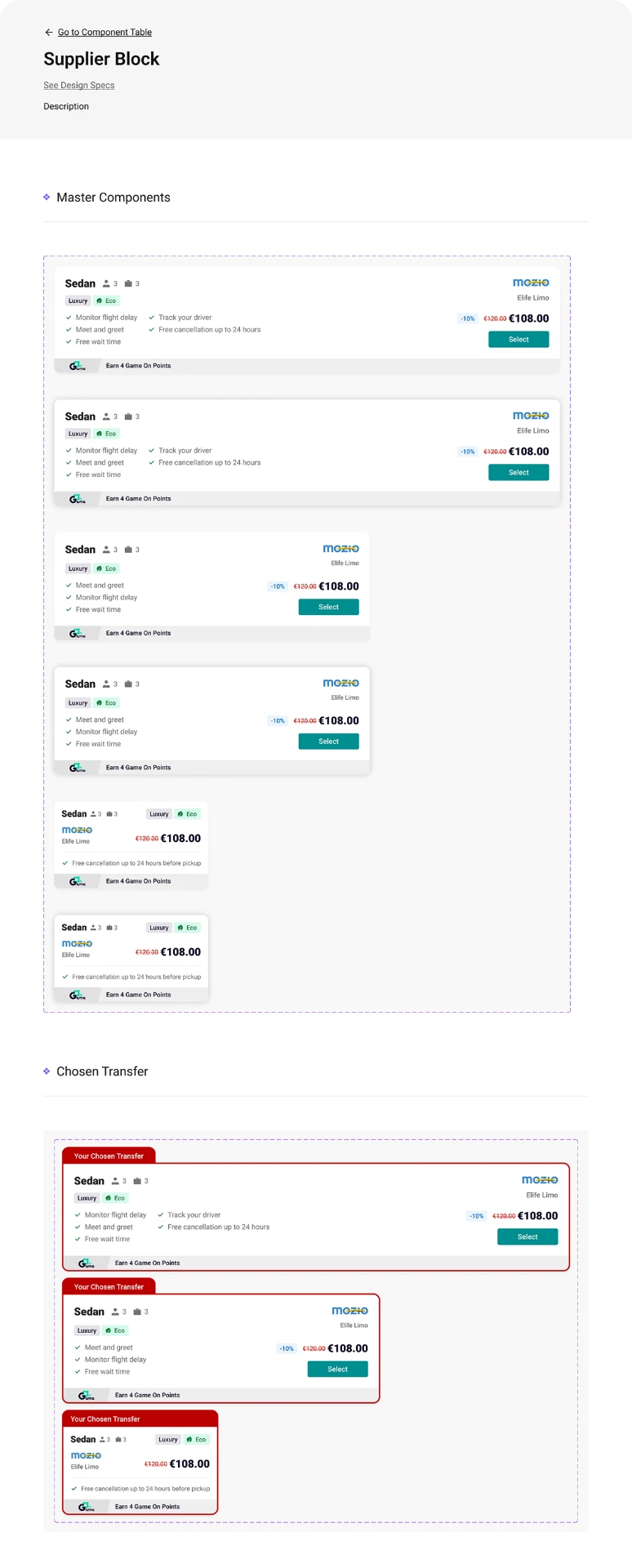
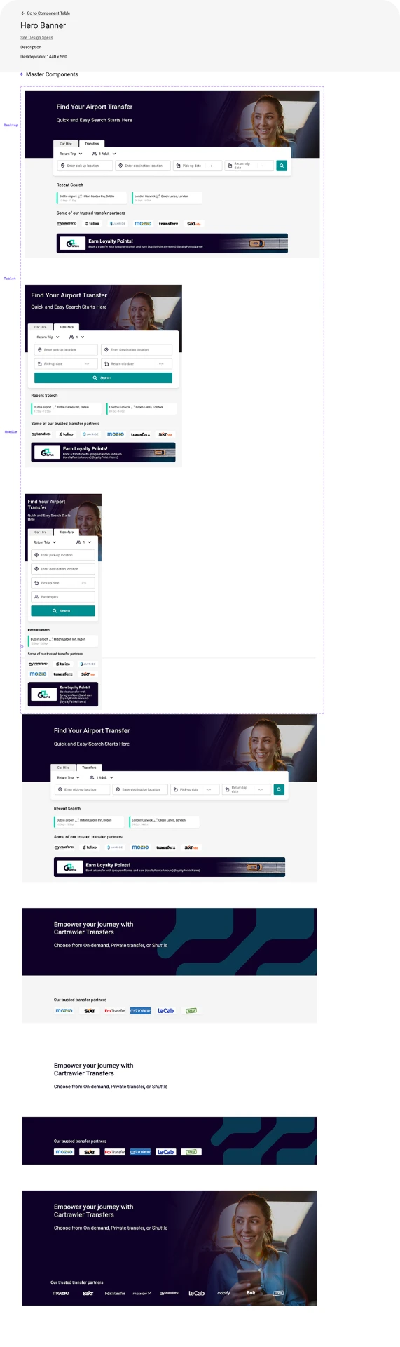
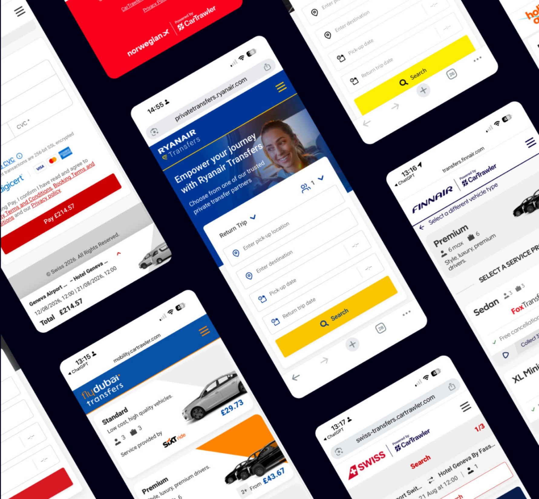
One structure, many brands.
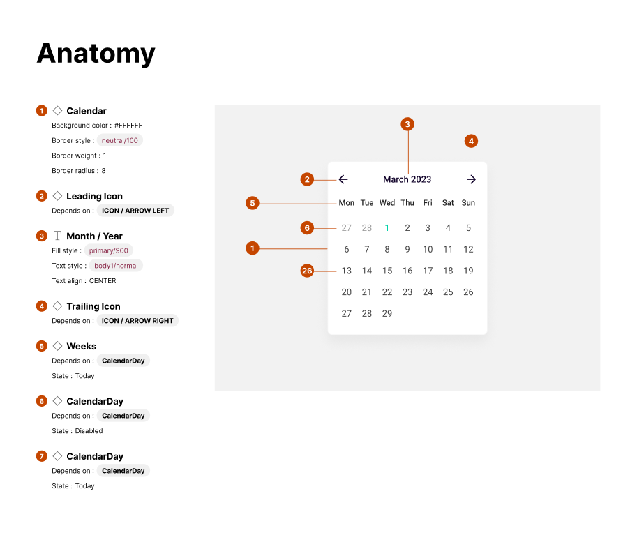
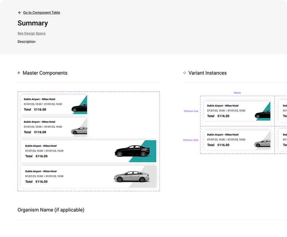
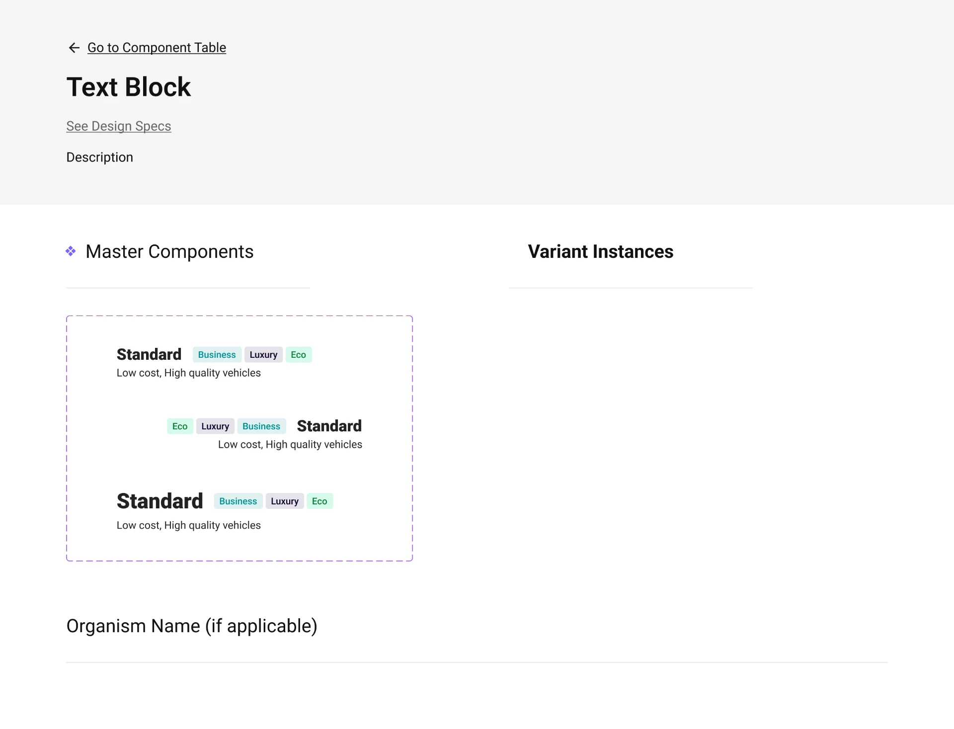
I led a lightweight design system that let two designers work in parallel and gave Engineering a consistent set of patterns. Brand tokens change per partner; structure, behaviour and accessibility rules stay fixed.
Handover
Design to engineering
- Reviewed feasibility and dependencies with Engineering.
- Documented states, behaviour and responsive rules.
- Completed a formal handover linked to delivery work.
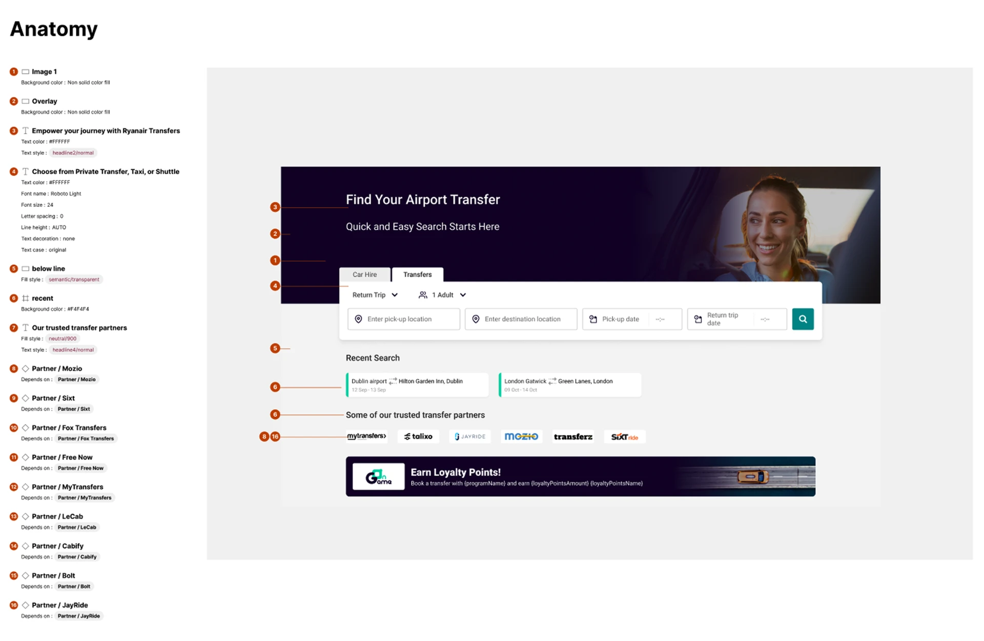
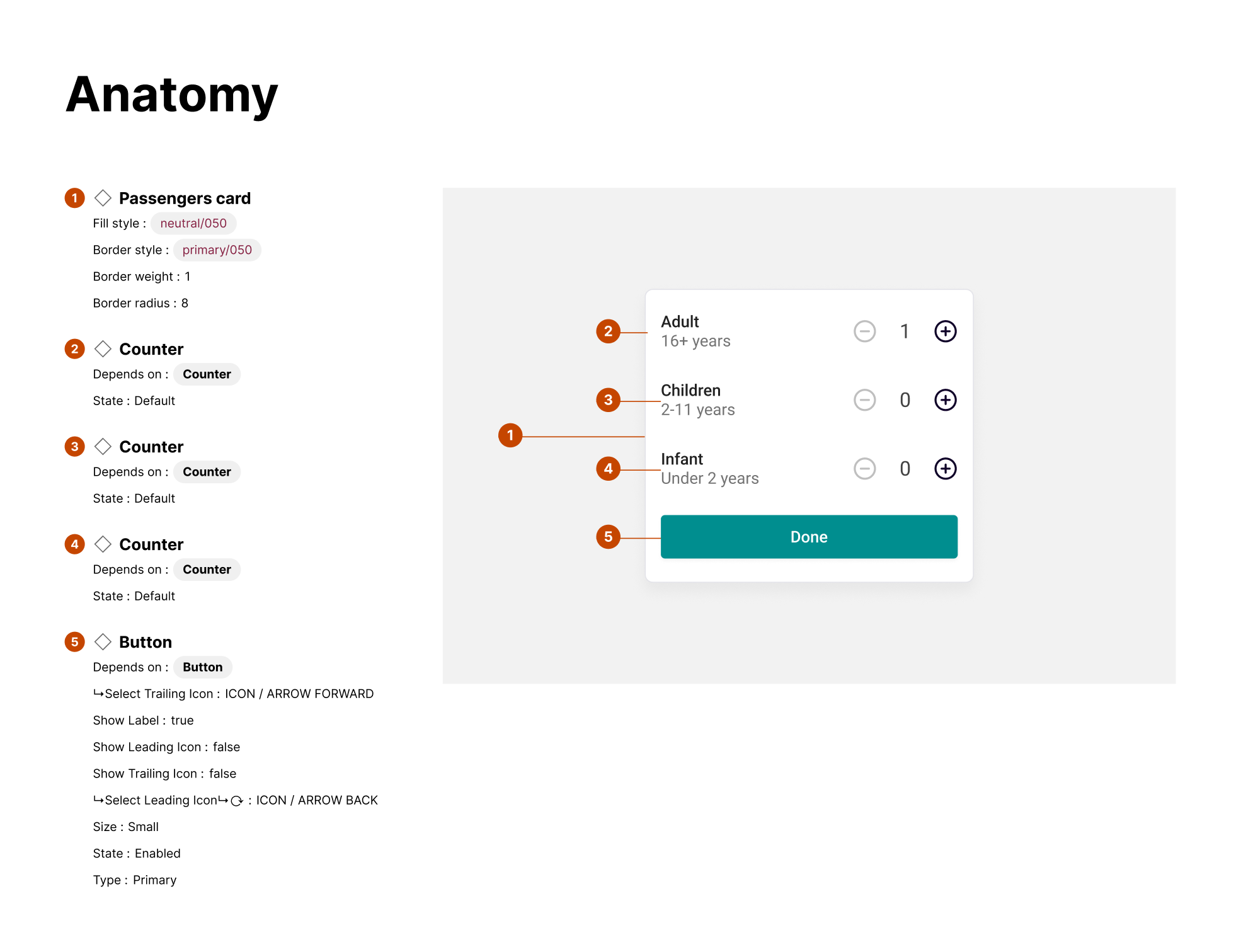
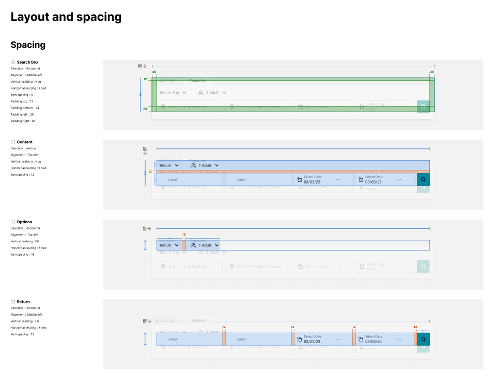
Two flows carried the whole product.
The core flow
Finding the right vehicle and supplier.
The checkout flow
Paying and confirming without friction.
Launch
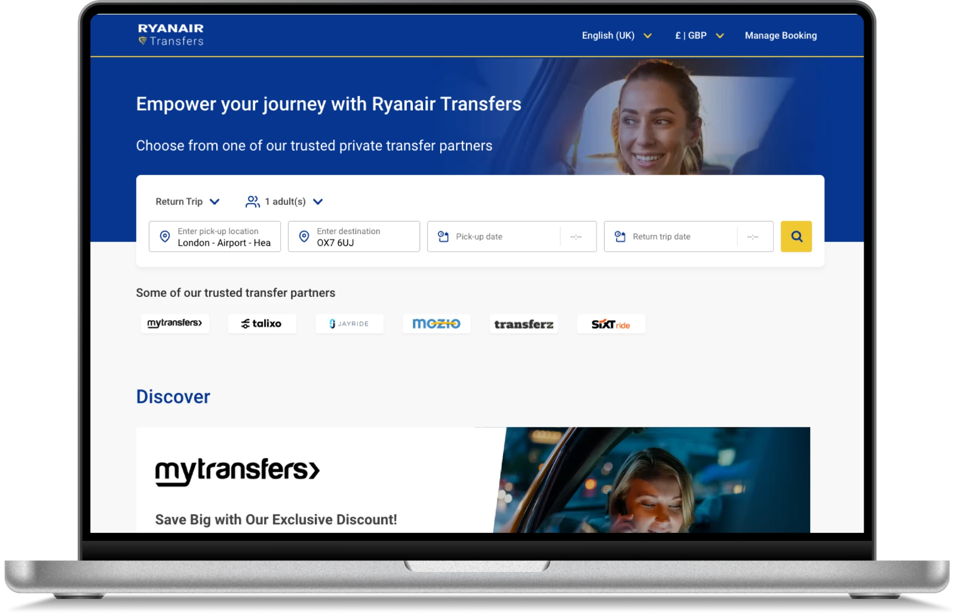
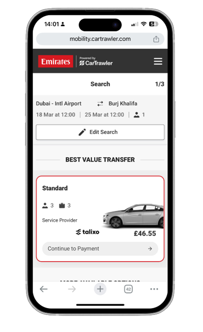
Live with Ryanair and Emirates.
These high-profile launches validated the scalability of the design system and the flexibility of the UX — supporting very different brands while keeping one consistent, easy experience.
Outcome
10+
partner rollouts
The white-label platform supported further airline launches.
20%
relative uplift in search to checkout
More customers successfully progressed through the booking funnel, measured against the previous rate.
2%
relative uplift in conversion
The completed experience produced a modest uplift in conversion versus the previous rate.
Thank you.
← Back to all work